

LABEL DESIGN CASE STUDY
Labeling Radiance.
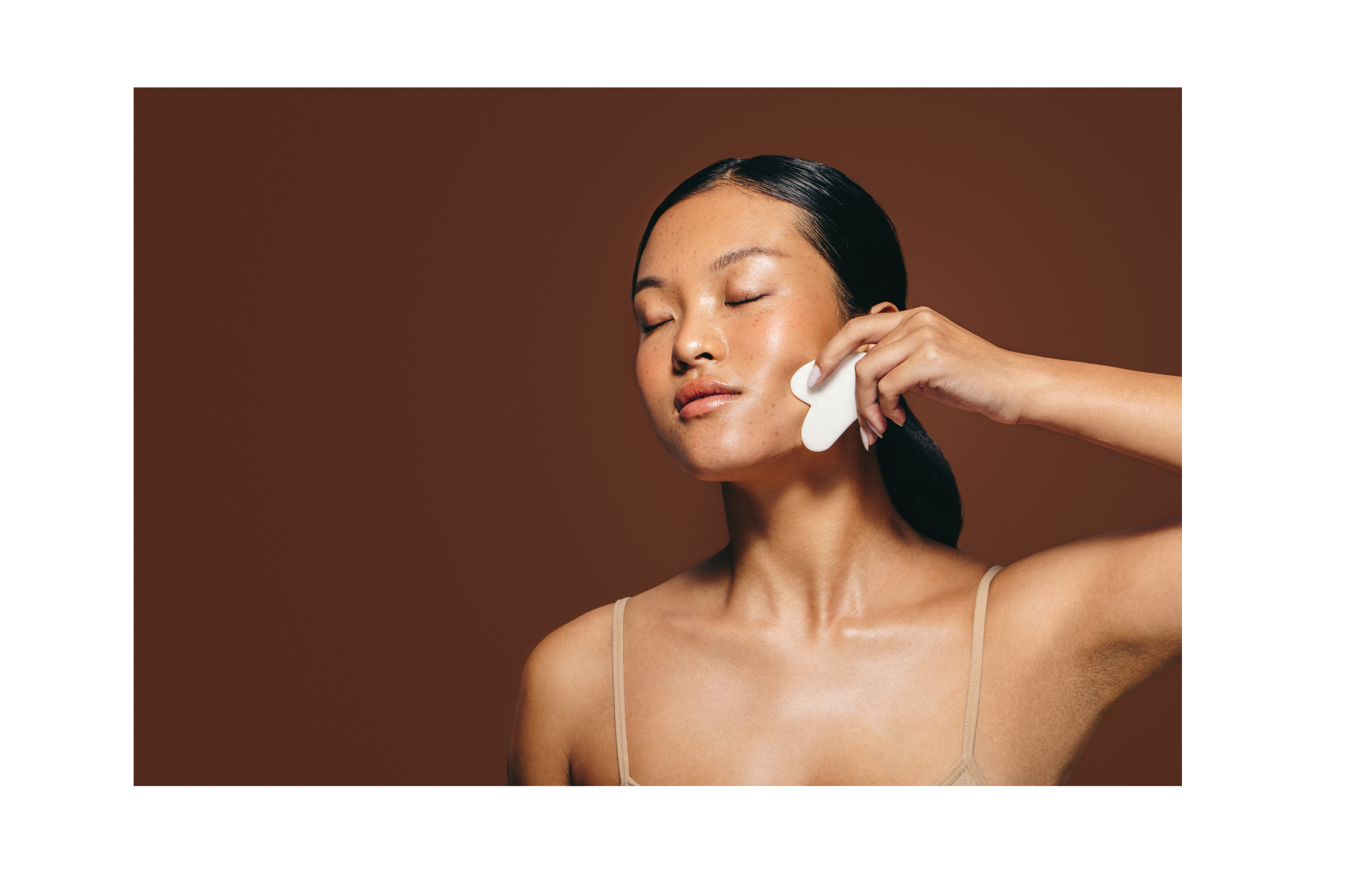
TASKED WITH BEAUTY
DESIGNING FUEL’S SKINCARE IDENTITY
FUEL Salon & Spa is a modern, high-end destination for hair, skincare, and spa services. Centered on the values of Focused, Unlimited, Extraordinary, and Life, FUEL offers personalized, transformative experiences that help clients look and feel their best, from the inside out.
I was tasked with creating a custom label for their skincare line to capture the essence of the brand and align the design with FUEL’s core values and premium client experience.


DESIGN DELIVERABLES
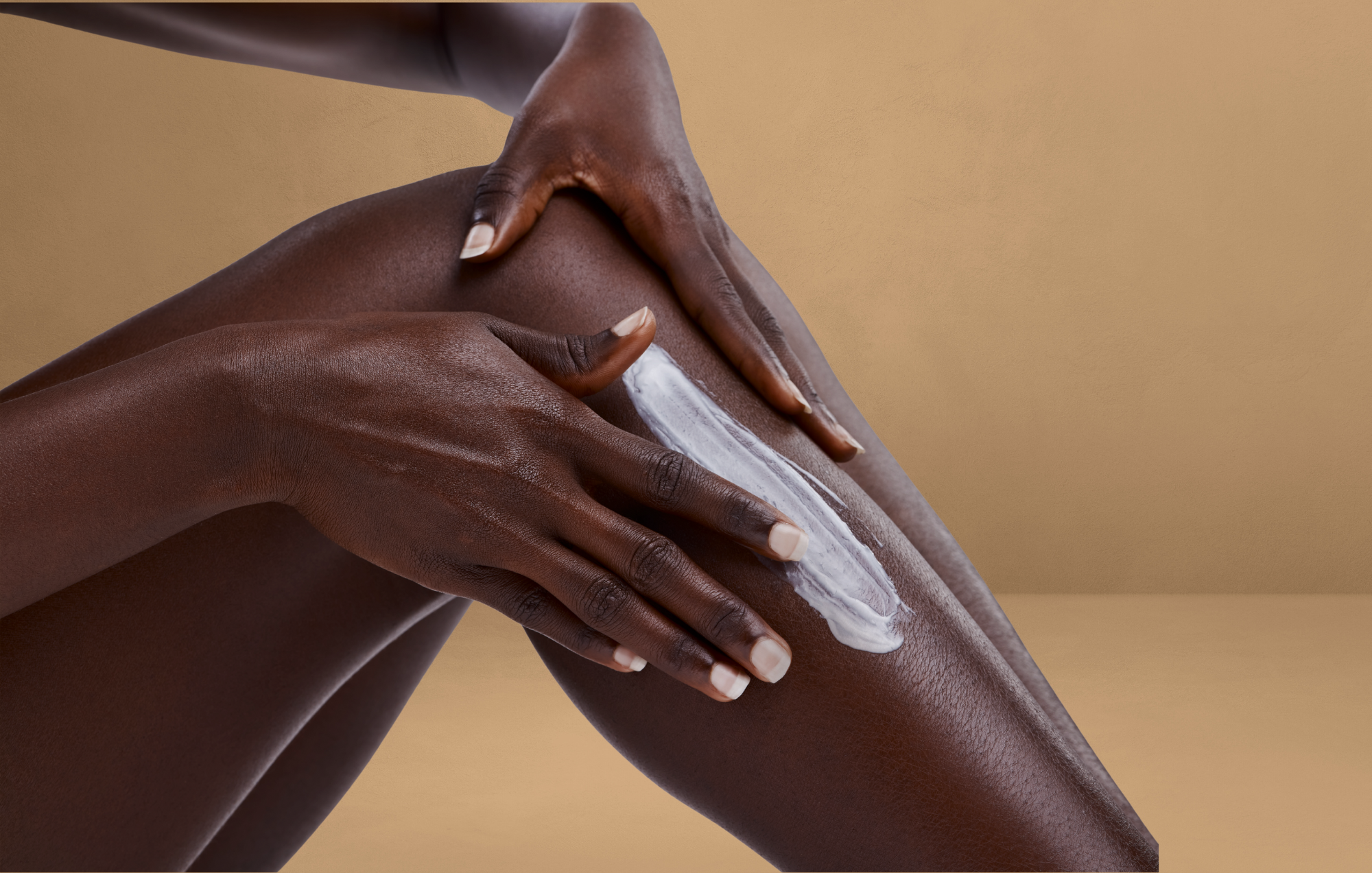
A Bloom in Every Bottle.
I led the full design process for a custom skincare label, starting with the visual concept and extending through typography, color palette, and illustration. Each design element was carefully selected to complement and echo the themes already present in FUEL’s brand aesthetic.
FULL-SCOPE CREATIVE DEVELOPMENT
Final deliverables included four fully print-ready label sizes: one for 4 oz. cleanser/toner, one for 2 oz. products, one for 2 oz. scrubs, and a shared label for 1 oz. and ½ oz. products.
MULTI-FORMAT LABEL CREATION


The Label.

A DESIGN ROOTED IN RADIANCE
Strong and grounded, the bold “FUEL” typography anchors the label. Soft floral elements move across the layout, symbolizing fresh starts, inner growth, and the care we give ourselves. Warm terracotta hues, drawn from nature’s subtle strength, bring a natural, elegant feel. Paired with clean, minimal design, the label became a visual expression of care for both skin and soul.